
Blown away by the truly breathtaking colors of the skies here in Texas!
Getting ready for my first color class here in Fort Worth at the Art Room https://www.artroomfw.org/get-involved!

Blown away by the truly breathtaking colors of the skies here in Texas!
Getting ready for my first color class here in Fort Worth at the Art Room https://www.artroomfw.org/get-involved!

Five years ago I set up this Realm of Color blog to be a repository of my research into color and the teaching of color. Then I decided to concentrate, for a couple of years, on painting, specifically so that I would understand better how to help painters with the difficulties of analyzing color use in their own work, and from that, developing their unique ideas about color in their paintings.
The painting (realistic/figurative) was my focus for three years (as well as drawing which has been a lifelong love of mine); then life intervened, and I was needed in Texas (!) to help out with my new grandbaby.
With the move, I found that painting became more difficult (actually, it has been problematic for me for most of my life! To understand why, please see my last post, ‘Art & Climate Change.’ in my Better Choices blog: betterchoices.blog. I have also reposted this mini-essay under my ‘A Painter’s Progress’ blog on my art website: www. jhart-artist.com.) so I returned to an older medium, paper paint chip collage; and not only collage, but really small collages, 4″x10″.
Suddenly I found a freedom to experiment which was harder to come by in the larger, more figurative paintings. I have done ten of these collages to date; they are to be the illustrations for a book of color that I am working on. I will be posting them over the next couple of weeks along with the color pedagogy I am using.
If you would like to see in real-life the collages attached to this post, and you will be in the Fort Worth, Texas in the next two months, they will be part of the Art Room’s 3rd Annual Small Works Show!


Dear readers: my apologies for taking an extended break last month. Taxes, Spring cleaning, and a number of submission deadlines interrupted my writing! But this month I want to explore one major function of color: its expression of the decorative.
Historically artists have tended to fall on a continuum, one end of which embraced the pleasures of color used decoratively, the other a move severely idealistic camp, which denounced the distractions and frivolities of color as inappropriate to the service of ideas and pure art.
The latter resulted in abstract painting in which color was limited to the primaries (red, yellow and blue) plus white, black, and gray. But I am more interested in the other end of the spectrum, as it were, where an artist could indulge in the full range of colors’ charms.
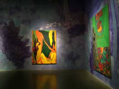
The description of painting as decorative is still frowned upon, but there are a couple of recent shows that are unabashedly decorative, though not solely so. One was Chris Ofili’s one man show at the New Museum in New York City this past December. I am indebted to Mira Schor for the photos the the Ofili exhibit taken from her blog: A Year of Positive Thinking. (Her collected essays, Wet and A Decade of Negative Thinking are wonderful reads.)
Chris Ofili is an Afro/British painter who lives in Trinidad. He won the Turner Prize in the UK, but became famous (or infamous) in NYC when he showed an unconventional and irreverent painting of the Virgin Mary using elephant dung. The fourth floor rooms in his show are of particular interest to me, because the walls behind the canvases have been painted with imagery in violet and blue colors that creates a background that has an ‘over-the-topness’ that I love. 
It reminds me of other times when the quality of the painting was not denigrated because it was decorative as well as expressive, thoughtful, innovative, etc. Before Modernism won the day in the beginning of the 20th century, the Nabis ( Vuillard and Bonnard) were deeply interested in color and pattern used decoratively. Bonnard was more sensual in his color palette, but Vuillard managed to explore psychological familial relationships within a decorative format.
The other painter that this room brings to mind is Whistler and his Peacock Room, which is now in Washington at the Freer. Of course, at the late Victorian, early Edwardian period (1877), people had not yet been convinced that ornament is crime!


But to return to Ofili, I think that Ms. Shor is right in wondering if this level of decoration would be accepted in the present day museum culture if Ofili were not of African ethnicity and living in the Caribbean. Coincidentally, Kehinde Wiley’s show just went up at the Brooklyn Museum and next post I will look at his use of color and the decorative in his paintings.
Color Action:
1. Create two color palettes of three colors each. One color should appear in both palettes. Mix paints for each palette.
2. Design one repeating pattern. These can be as simple as stripes as ornate as over-all florals. Paint this pattern on 8″ x 10″ cardboard using the colors from one of the palettes.
3. Design a motif. Again this can be as simple as a square, or as ornate as a paisley. Paint ten of these motifs in varying sizes between 1 inch and 3 inches using the colors of the second palette.
4. Cut out the motifs and arrange them on the patterned painting.
5. Reverse the colors, using different palettes for pattern and motif; and repeat the process.

Last post I talked about Gerhard Richter and the way he used color for its functionality. Another great artist who also did this, but in an even more stringent way was Sol LeWitt (1928-2007) an U.S. artist known as one of creators of Conceptual art.
His basic invention, in a nutshell, was that the idea of a piece of art was more important than the artwork itself. So what LeWitt did was to write instructions for his works, especially his large scale wall drawings. These instructions of how the work was to be made were then followed by a group of assistants who did the actual drawings to his exact specifications. 
The beauty of this concept is that the piece can be made over and over again, without loss even if the artwork gets destroyed! You can follow this process in this article from the Virginia Museum of Art.
Now, for me, where it gets interesting is when LeWitt started to use color. He is known as a Minimalist and a classicist, and certainly the early work bears this out. But as Wikipedia mentions, after he visited Italy and saw the early Florentine frescos, he moved from using graphite pencil and crayon to ink wash and acrylic paint. He still gave very detailed instructions on where and how the colors were to be laid out. He chose a small palette often of pure hues: yellow, blue, red,green as in Wall Drawing #1136;

or sometimes as in Wall Drawing #681C (1993) below of gray, green, orange, violet, etc. (secondary hues). 
The results were highly decorative, in spite of his being a conceptualist and minimalist. However, in the movie on him by Chris Teerink, the word decorative is never mentioned!
And yet this is one of the most basic functions of color. Once an artist uses color, even in this most systematic of ways, the essential mechanics of color are to produce pleasure and beauty and to be decorative…it can’t be helped!
So next post I promise to finally get to Chris Ofili and the unabashed decorative use of color.
Color Action: pick a small color palette of four colors. Pick the medium (pencil, paint, marker, etc.) Now invent a simple system for generating a color drawing. Make the drawing to see if it works. Finally send your instructions to a friend, and see what the drawing looks like when she draws it up!
The header this week is a detail from a water-colour that I painted in the day (1978 minimalism!).

As an art educator who teaches people how to use color, I have been disturbed by a nagging question that no one seems to ask: what is the goal of teaching coloring? Putting aside the problem of whether coloring should be set up as a separate field of study, distinct from painting or design, the larger query is: what is an artist’s purpose in using color?
For Josef Albers, whose Interaction of Color is still one of the primary textbooks for teaching color at the college level, the answer is clear: his exercises improve the student’s eye, her sensitivity to color. But as James Elkins writes in Why Art Cannot Be Taught (p. 26), “…is Albers’ artificially high level of color sensitivity really necessary to painting? Some kinds of art require nuance and others don’t.”
Or, to expand on this thought, some kinds of art require color, some don’t. Some kinds of painting require the knowledge of color theory, some don’t. Some kinds of artmaking require expressionistic color knowledge, some psychological, some retinal. Is it useful or even possible to craft a color course that fills all these needs?
I was reminded of Elkin’s point last week at the Museum of Fine Arts in Montreal when I had the pleasure of spending time there in front of the large Gerhard Richter abstraction, AB Mediation. A couple of summers ago in Germany was the first time I had come face to face with Richter’s work and it was astonishing! His color is juicy and very enjoyable, but, and here is the interesting part, he is not a colorist nor in a colorist tradition! I would describe his work as using color functionally. What I mean by this is that he treats color as material, and what it does is the result of what it is. So, when he chooses from 40,966 color groups at random for his 256 Colors, 1974 (below), he doesn’t have to worry about whether it will work or not-it has to be beautiful because of the nature of colors when grouped!
 (As an aside, this is the pleasure and the problem with those walls of color chips that are found in any paint store. All those colors together make a spectacular display that is almost impossible to use. Trying to choose a chip from that overwhelming selection not only demands the ability to differentiate from close to 2,000 colors, but it also requires the courage to break the surface of what is experienced as a powerful color entity!)
When you watch Richter creating his paintings (in Gerhard Richter Painting, a very interesting documentary available on Netflix), like the AB Mediation, you will see him choosing his color from barrels of paint. The colors in these barrels are chosen for their unambiguous identity as red, yellow, blue, black, and white. There is no question, for instance, about what kind of yellow (shifted to the red or green side? less saturated? lighter or darker?). It is just a yellow that everyone can agree is a yellow. He takes paint from these barrels and throws them on the canvas and let’s them do their thing! And the results are thrilling. But the method is as postmodern as the super large squeegees that work with the physical qualities of the paint itself.
For me, the other artist that comes to mind in a similar tradition is Sol LeWitt who takes very simple mathematical formulae that generate systems that activate line and color to create lovely and decorative color experiences. But let us leave that for a future post!
Color Action: think about how you use color now in your work.
List the artists whose color work most moves you.
And finally, remember color experiences that you have had in your daily life.
Using words and pictures to describe these color memories, see if you can hit upon what truly interests you about color.
Now what would you need to learn about color to use it successful in your art?
The header this week is a very small collage of mine. In the crazy upside down world of online art is looks huge compared to a detail from AB Mediation which fills a whole wall in real life!
I was going to write about Chris Ofili and color and the decorative, but, dear readers, please bear with me as I need to get something off my chest or at least off my mind. There is an assumption among many people, and some who really should know better, that if an artist uses scads of color all pitched to the nth degree, well, she must be a good colorist. One sees this a lot with beginning painting students who use every fully saturated color that they can get their hands on in an effort to justify their identity as a painter. The effect is like watching someone who is trying to sing but who is instead screaming his head off!
This has been on my mind lately because of a number of things that I have seen. First I received a post from one of my favorite blogs, The Plant Curator, regarding an artist, Nicola Simbari (1927-2002)  whom they designate as “The Plant Colorist”. Now I don’t mean to be disrespectful to an artist who is no longer with us, but the way that she forces these garish colors to somehow delineate the forms of flowers and figures is really hard to look at for any length of time. (This is Girl in Yellow, 1964)
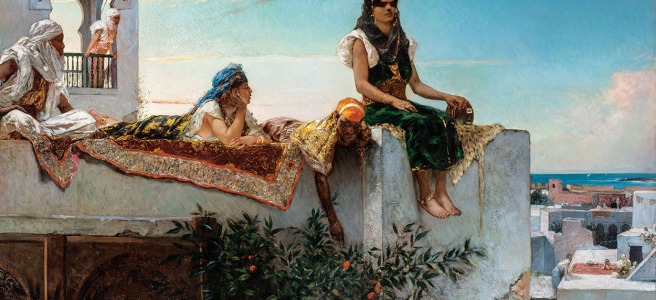
Then just the other day I returned from seeing the Marvels and Mirages of Orientalism show at the Beaux Arts Museum in Montreal. And as long as I’m bashing dead painters, most of the work by  Benjamin-Constant could only be viewed comfortably as illustration and really corny illustration at that. But the text on the wall as one comes in describes him as an “ ultra-colorist” and “master colorist following in the footsteps of artists like Delacroix.” Now from my point of view, this is rather like claiming Thomas Kinkade is a master colorist following in the footsteps of Turner (and probably many folks believe this to be true!) (The Benjamin-Constant painting above is The Favourite of the Emir, about 1879, oil on canvas, photo courtesy of the Museum of Fine Arts, Montreal.)
They might have gotten away with this description if there was not embedded in the center of the show five wonderful Delacroix paintings looking like diamonds among paste!
All of which got me thinking about why some things work coloristically and some things don’t. Part of it is, I believe, a sense that one gets from artists like Simbari and Benjamin-Constant that they don’t trust their audience. They have to lay everything out in startling, eye-catching colors and effects that leave nothing to the imagination and nothing for the eye to do except be manipulated and impressed.

(The detail above is from Arab Actors or Buffoons, 1848 by Delacroix) But Delacroix requires a much more nuanced response: some of the forms are hard to make out, and the brilliant cadmium orange and rich teal blue that are his signature colors are integrated into a sea of browns and ochres.
The curious thing about the show was that the contemporary photographs of today’s women in harem and Scherazad poses (a necessary politically correct commentary on the sexism and racism of the older paintings) shared a much greater affinity visually to the Benjamin-Constant work than did the Delacroix. Again, this has to do with how the eye is controlled by a photograph versus being allowed to run free in a painting.
Anyway, in order to clear my palate, in a manner of speaking (too much sugar!) I went into the permanent collection where there is a very large and spectacular Jean-Baptiste-Camille Corot (L’île Heureuse, about 1865-1868).  Ah, less is definitely more!
 Corot uses a neutral palette: greyed off greens, browns, the sky made of light barely there yellows and very light blue grays. With this very limited palette he creates a sense of the light and humidity of this shoreline landscape entirely from weight contrasts.
The tower sinks into the background because the grays that describe it are very similar to the sky behind it. The two figures and tree in the foreground are made from a series of charcoal shades that produce the illusion of backlighting against a warm yellow light that is the sky at that point in the painting. Now that is a master colorist!
Color action:
1. pick two fully saturated complementary colors.
2. Chose five (5) neutral colors to create a deep neutral palette.
3. Chose five neutral colors to create a light neutral palette.
4. Paint two small paintings in a subject (landscape, abstract, figures) of your choice using these two 7 color palettes. You may want to play with the weights of the complementary pair!
My header for this week is a detail of my Dried Protea, acrylic on canvas.

In honor of St. Valentine’s Day, the subject of today’s post is the color pink.
Now here is a curious thing: when one adds white paint to green color, one gets a light green. When one adds white to blue, one gets a light blue. But when one adds white to red, one gets pink. Pink is a light red, but the fact that it has its own name suggests that it is so much more!
There are only eleven colors that are their own categories in every language and they are: white, black, red, green, yellow, blue, brown, purple, pink, orange, and grey. In Berlin and Kay’s strange and seminal study, Basic Color Terms, of how languages put on categories for color and in what order, they postulated that all languages have words for black and white. If there is a third color, it will always be red. A fourth color will be either yellow or green (but not both), and so on down the line until the eighth term when it will either be pink, purple, orange, or grey.
Pink is in this last category as is brown (black added to orange) and grey (white added to black-or black added to white)-I will be talking about both brown and grey in future posts. These three colors are peculiar in that they are not pure hues, but I believe that language reflects the very extensive and powerful visual and psychological meanings and associations that these colors embody.
For pink the connection is most profoundly linked to our bodies: the light as it streams through the thinner parts of our bodies lightens the red blood turning ears and fingers pink 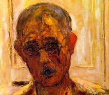 (see the detail of Pierre Bonnard’s late self portrait, 1939); the blood rushing to the surface of our skin when we are angry or embarrassed or hot turns knees, hands, noses, cheeks pink; disease and fever changes the color of the whites of our eyes and our skin (if we are white) to an unhealthy deep rose; and finally the blood flushing into the genitals and lips when we are aroused creates a tumescent pink.
 Pink also represents the charm of the natural world: roses with their lovely scent; fruits like watermelon and berries with their distinctive flavors and scents; and the quality of the light at dawn.
But it is the color’s resonance in the culture that most affects art. Pink in our time and place has a tenacious hold on the idea of the feminine. Of course, baby girls are dressed in pink to represent innocence, though before the 20th century pink was a boy’s color as it was considered an infantile form of the red that military men wore. So much of what is targeted toward women consumers today depends on pink: makeup, underwear, clothing, and even computers and IT products. If the object is packaged in some form of pink, it is understood that it is geared toward women, and the subtext is that pink is seductive and will help the buyer be more seductive.
The quality of the pink color is also important. Baby girl pink is milder and sweeter than teenage girl’s pink; and then there are fuchsias that are aggressive. For a painter, pink presents some quandaries and some opportunities.
 Janet Werner explores some of these in her paintings. In Raivie, the commodity and the consumer, the clothing and the wearer are strangely conflated; and it is hard to know if the luscious pink of the sweater is a beautiful excrescence of the woman’s personality as seen in her eyes, or if the pink of the sweater has moved into the woman’s body to be reflected in her eyes!
The kitsch factor of pink can be very high (see below: Lawrence Alma-Tadema’s ‘The Roses of Heliogabalus’ a painting from the Victorian period),
 but it can be subverted as Janet Werner does in her ‘Ef
 ’and ‘Dancer’ where the pink is set off by unsettling images that ridicule the girly qualities of the color.
Pinks are some of the most luscious colors on my palette, and it would diminish my art to eliminate them in order to appear more serious or, g-d forbid, more macho. In my next post I will look at juicy, luscious, feminine colors and their use in the decorative in painting.
Color Action: pick ten pinks either in chips or painted swatches. Try to extend the range from the most silky reticent pink to a pink so sweet that it makes your teeth ache to the deeper seductive roses to a bold fushia. Note the border between what you would consider a dark pink and a real red!
Note: Janet Werner’s show at Parisian Laundry in Montreal is up for one more week!
Photo credits: Detail of a late self-portrait (1939) by Pierre Bonnard in a private collection. Lawrence Alma-Tadema’s ‘The Roses of Heliogabalus’ up at the Leighton House Museum, London posted on one of my favorite blogs, The Plant Curator. All photos of Janet Werner’s work, except Raivie which is my photo, are courtesy of Parisian Laundry, Montreal. The header this week is of

I’m relying on color to produce meaning, without it being something that you can articulate…I’m trying to allude to a tone, a mood or a psychological state-through color.
Janet Werner, interviewed in M-Kos 4/23/12
The uses of color are legion; certainly as many and varied as there are painters and artists. But one can’t help but place them into categories-what academicians call discourses. For me, as someone who teaches coloring (as painters teach painting, and draughtsmen teach drawing), those categories help determine what I teach about color, or, more accurately, what students need to learn about color.
Some uses, for instance the naturalistic one, are fairly straightforward, and an artist like Georgia O’Keeffe can depend on what the visual world suggests to determine her palette. A subcategory of naturalistic color is what David Hornung in his very good color textbook, Colour: A workshop for artists and designers, describes as color as it occurs in “retinal” or “perceptual” painting. For this kind of painting, the artist paints exactly what she sees without allowing the mind to determine what color the object is supposed to be. So, as an example, a lily might be white, but when studied carefully, the petals in shadow would be mauve, and the body of the flower appear to be a light green.
Now, the further an artist departs from the naturalistic or realistic, the more she must decide what she wants the color to do, or, in other words, how she plans to handle it. .
For Janet Werner, whose wonderful paintings can be seen at Parisian Laundry here in Montreal, color operates as a generator of psychological states, an important and powerful aspect of color. Her paintings have their genesis in color; color suggested the subject and content of each painting.
Ms. Werner paints portraits of fantastical characters who have the uncanny ability to engage us in their emotions. And that engagement, I find, is  engendered by the color that envelopes them; that emanates from their outfits; that floats through their eyes; and that washes over and through their skin.
The images that the artist paints are strange and intriguing. But it is, in fact, the colors that draw us into the portraits and into an unsettling questioning of what these personages are thinking and feeling.
 Ms. Warner also uses mutable colors (what she calls “modulated” colors)- blue/grays; beiges; mauves- to, as she says, create “a color space…that is indeterminate and not grounded, which creates a sense of disorientation.” (That brings us to the idea of the spacial effects of color, but, as that is another big subject, I will leave it for a future post.)
Meanwhile, next week I will be posting some more of Janet Werner’s work when I talk about the color pink, in observance of Valentine’s Day!
Janet Werner’s work will be at Parisian Laundry through the 14th of February.
Color action: remember an emotion that you had recently. Try for a feeling that was difficult to put into words. Now pick five colors to create a palette that reflected this emotion. You can use any medium to make the chips or use chips from a paint store or cut-outs from a magazine. Show your palette to friends and see if it makes them think of a similar emotion that they have had.
Photos:
Featured picture: Nero, 2013, Oil on canvas. Courtesy the artist and Parisian Laundry.
Janet Werner in front of Crying Eyes, 2011. Oil on canvas. Courtesy the artist and Parisian Laundry.
Earthling, 2012. Oil on canvas. Permanent collection of Musée d’art contemporain de Montréal
Zero Eyes, 2010 45″ x 55″, oil on canvas. Courtesy the artist and Parisian Laundry
While writing about Georgia O’Keeffe (1887-1986) last week, another woman painter who made her name in the same Modernist period (beginning of the twentieth century) came to mind: Sonia Delaunay (1885-1979).  Now this is definitely a case of comparing apples and oranges: both are important women painters from the same generation, and both were very focused on color, but that is where the similarity ends. However, the comparison is useful, I believe, as a way to look at two issues. Firstly, the connection of painting to fashion and commerce (and as a subtext, these women painters’ relationships to their respective husbands!). As we saw last post, O’Keeffe allowed her husband Stieglitz to contract her work to advertise textiles. Sonia Delaunay, on the other hand, actively solicited commercial deals for her very avant garde abstract art as a way to support her family (her husband Robert Delaunay, a very important painter and art theorist, and young son, Charles). The Delaunay’s were also part of a group of artists and institutions (the Bauhaus being the most well known) who believed that the new abstract art being invented at that time should not be constrained to easel painting, but should impact all forms of design and art. Sonia Delaunay’s designs for textiles, clothing, theater costumes,
 murals,and more esoteric work like the painting for Blaise Cendrars’ poem ‘The Trans-Siberian Express’ (which is a fold-out ‘book’ that is two meters long when fully extended, and is the featured image at the top of this post) reflected this mission.
The second issue is more relevant, perhaps, to the concerns of this blog, and that is the question of how painters use color. These two artists felt color was central to their art and both used abstraction in their works. For each, they were partial to saturated hues: red, green, blue, black.

Sonia Delaunay, Composition
Georgia O’Keeffe, Blue Flowers
But the very different ways that they used relatively similar palettes is what is interesting. O’Keeffe tied her colors to real objects even when highly abstracted. Hers was what I would describe as a naturalistic palette. As admirers and critics wrote at the time of her first New York show (1925): …nothing rivaled her “red apples,…purple-green alligator pears, flaming red cannas, dead white calla lilies and yellow and red autumn leaves…O’Keeffe had an uncanny ability to…home in on the essential yellowness of a tree, the redness of a barn, or the blueness of a petunia.” (excerpt from The Color Revolution p.147 ). The colors did not so much describe the objects as stand in for them.
For Delaunay, the forms that the colors filled were so abstract (usually discs) as to be almost neutral, even when they were inspired by something real such as a tango dance in the photo below (detail of ‘Le Bal Bullier’ 1913).  The important thing was how the colors functioned next to each other. The way color is perceived depends on simultaneous contrast and afterimage (please see the glossary for an explanation of these terms). The Delaunays called it ‘simultaneity’ and it was how color operates when chiaroscuro is eliminated. The colors create movement, rhythm, and light by the interactions between pure hues.
In our time, I would suggest that Bridget Riley’s works are are the descendants of this way of handling color.

Bridget Riley, Shadow Rhythm, 1989
What other ways are there to use color in painting? Of course, as many as there are types of painters, but in my next two blogs, I will be looking at two: a decorative way (Chris Ofili at the New Museum, NYC until 2/01/15) and a psychologically-charged mode (Janet Werner at Parisian Laundry, Montreal until 2/14/15).
Color Action: if you are a painter, think about what paintings move you. How is color used in those pieces? And what do you think the painters who did those works were after with the color? If you had to label the color-use, what adjectives might you choose?
The header this week is a small paper collage of mine from three years ago. Again, be very aware please about how scale in very distorted for art online!

Chromophobia manifests itself in the many and varied attempts to purge colour from culture, to devalue colour…this (…)is usually accomplished in one of two ways…[1] colour is made out to be the property of some ‘foreign’ body-usually the feminine, the oriental, the primitive, the infantile, the vulgar, the queer or the pathological. [2] color is relegated to the realm of the superficial, the supplementary, the inessential or the cosmetic.
David Batchelor Chromophobia p.22

Six weeks ago Georgia O’Keeffe’s painting, Jimson Weed/White Flower #1 painted in 1932 sold at auction for a record $44.4 M, the highest price ever paid for a woman painter’s work. (There were, of course, lots of comments made suggesting that this would presage a boost in the sales of paintings by women or in the amount women’s art can command, but since this was not the work of a living artist, I have my doubts.) Be that as it may, it brings up an interesting story about O’Keeffe and how her work was marketed by her husband and agent, Alfred Steiglitz in that early Modernist period at the beginning of the twentieth century. (This story comes from The Color Revolution by Regina Lee Blaszczyk.) Steiglitz was a photographer and a gallery owner. He made a series of very beautiful and erotic photos of O’Keeffe,

Alfred Stieglitz (American, Hoboken, New Jersey 1864–1946 New York) Gift of Georgia O’Keeffe, through the generosity of The Georgia O’Keeffe Foundation and Jennifer and Joseph Duke, 1997
and promoted her flower paintings as being quintessentially feminine and Freudian (Freud’s theories on sex at that time were very hot, if you forgive the pun!). The shapes of her flowers were, of course, suggestive, but equally stimulating were her colors.
Her daring and vivid use of color shocked (American) observers, who often attributed her palette to gender. Critics read her words as verifying her feminine and passionate nature, particularly when she made remarks like, “I paint because color is a significant language to me.” (p. 146, Ibid.)
At the same time in New York, a silk fabric manufacturer, Cheney Bros. had decided that they would be more successful selling to the up-scale customers who still had their dresses handmade by seamstresses rather than to the mass market customer who was buying ready-to-wear dresses in manmade fabrics like rayon. Cheney decided on an advertising campaign that would cater to the sophisticated customer who was knowledgeable about art and specifically about the Modernist cutting-edge painting that was focused on brilliant colors. Georgia O’Keeffe was the perfect choice, being both avant-garde and female. They approached Steiglitz about a contract to use O’Keeffe’s flower paintings in their brochures and windows, and after a brief hesitancy, he agreed.

Georgia O’Keeffe (1887-1986) ‘Flower Abstraction.’Whitney Museum of American Art, New York; 50th Anniversary Gift of Sandra Payson.
This painting which is now in the Whitney is very like the one of the series used. Cheney also used Marie Laurencin and Kees von Dongen’s art for this campaign. (There are a couple of spectacular von Dongens still up at the Montreal Museum of Fine Arts). I think this story is interesting because it happened in 1926, almost one hundred years ago, and it happened to a woman painter whom we think of as very remote from the commercial world. It also suggests to me that there was at that time, a certain amount of lead time from when an avant-garde style was created and when it was accepted by the general public. It was represented a dividing line between the elite in the know and everyone else. Even forty years ago, Warhol could create a look that took some getting used to. But today there is no space between the creation of a style and the use of that style to sell products (think of Murakami’s paintings on Louis Vuitton pocketbooks!). Art segues seamlessly into fashion which sells commodities. And color is often the most powerful selling point.
Which brings us back to what do artists of a more philosophical bent do about color? They can avoid it of course. And in this they locate themselves in an old discourse that has always seen color as shallow, feminine, anti-intellectual (as Batchelor writes), and in our time, the whore of commodification. But is the greatness of an artist somehow sullied by the use of her work in fashion or in any decorative format? Next time, I’m going to be looking at another woman painter from the Modernist period who had a very different relationship to color in her work (and to her husband)!
Color Action: this is from a post by Rob Walker on how to refresh one’s way of seeing. Take time this week to go on a single-color scavenger hunt. Pick a color, say red, and note the sheer variety of reds you will see, especially in the city. Make a record of where you saw them, and what they mean or symbolize, whether they are additive or subtractive colors, and what cast they are.
Header for this week is my painting, White Dahlia bloom. Hard not to think about O’keeffe when one is painting flowers!
