Liberated Color

Sometimes I think that when we see art that was made in the distant past, we are only able to feel the merest sensation of what it must have felt like to have seen it contemporaneously to its creation. This thought haunted me as I made my way through the spectacular painting show, Van Gogh to Kandinsky, at the Montreal Museum of Fine Arts. Those vibrant, outrageous colors made me very happy, but there could be no ‘shock of the new’ to quote Robert Hughes. As I wrote a couple of weeks ago, we have been habituated to colors that bright and brighter all our lives in what we are used to seeing on screen.

Still, it was interesting to follow the liberation of color during the late nineteenth century up to World War I: first to see how color was just intensified as in the paintings of Van Gogh and Gauguin-still connected to reality just enhanced.3. Van Gogh to Kandinsky - Works of art exclusively presented in Montreal - MMFA_Page_03

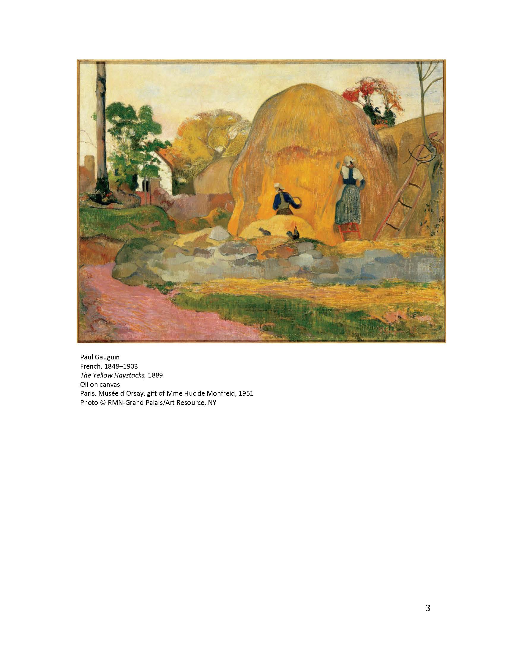
 Paul Gauguin French, 1848–1903 The Yellow Haystacks, 1889 Oil on              canvas Paris, Musée d’Orsay, gift of Mme Huc de Monfreid, 1951 Photo © RMN-Grand Palais/Art Resource, NY.

T46.1036
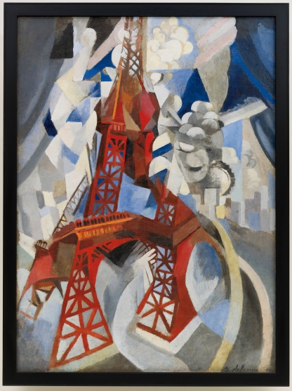
hen it was allowed to take off, tentatively attached to semi-abstract images as in Robert Delaunay’s (1885-1941) Red Eiffel Tower (1911-1912) New York, Solomon Guggenheim Museum.


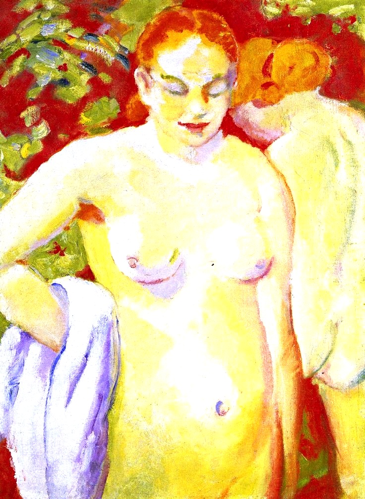
Color was made to stand in for the painter’s feelings, (a visual example of what Kandinsky called ‘inner necessity’) though still anchored in the visual world (as in the painting below)                                              

3. Van Gogh to Kandinsky - Works of art exclusively presented in Montreal - MMFA_Page_11

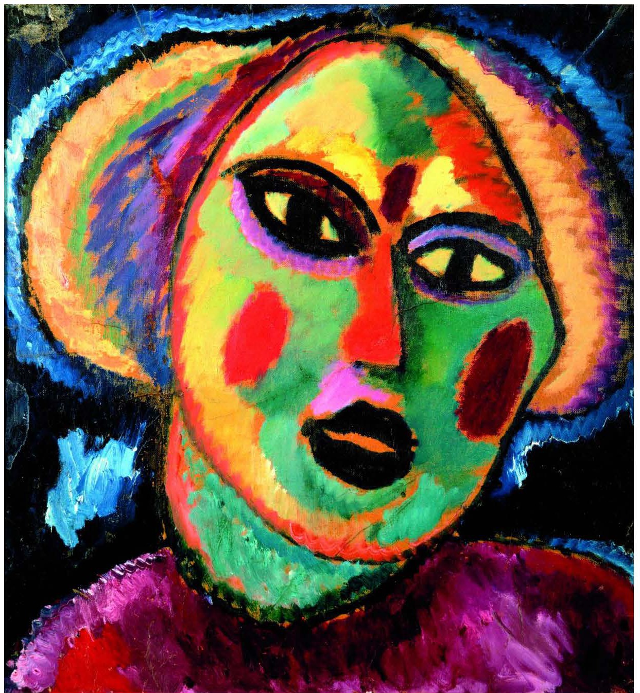
Alexei Jawlensky, Russian, active in Germany, 1864-1941,
Girl with Purple Blouse, 1912 Oil on paper mounted on canvas,                      Cologne, private collection);

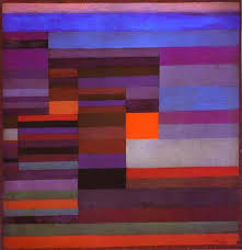
and finally inexorably it was left to stand on its own, sometimes in some type of relationship to the image, sometimes not.

3. Van Gogh to Kandinsky - Works of art exclusively presented in Montreal - MMFA_Page_12

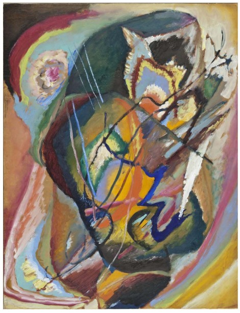
(Wassily Kandinsky Russian, active in Germany and France, 1866–1944 Untitled, Improvisation III, 1914 Oil on cardboard Los Angeles County Museum of Art, museum acquisition by exchange from the David E. Bright Bequest © Estate of Wassily Kandinsky / SODRAC (2014) Photo © Museum Associates / LACMA)

The show clearly traced the movement of ideas about color and expressionism through the efforts of contemporary gallerists. It was exciting to follow the discourses that ran from Van Gogh to Cezanne to Kirchner to Kandinsky, and so on. Certainly, as a painter, I would like to believe that artists revolutionize the way people see, but artists are embedded in their time period, even painters like Van Gogh who was marginal during his lifetime. And at the end of the nineteenth century, certain non-art developments in the society helped this freeing up of color for painters. The big thing was the invention of premixed paints in tubes, a new expanded selection of vibrant light-fast colors that did not have to be hand made by the artist. This was part of a larger color revolution in chemical technology.

Regina Lee Blaszczyk in her book, The Color Revolution writes about the invention and development of chemical dyes that took place in France and then Germany, with Germany winning the lion’s share of the market for synthetic dyes. These dyes created a huge range of colors which were organized into swatches for the clothing market. Again, the idea that color could be separated from the object and chosen on its own merits was abroad in the society. And there was a lot more and brighter color to be seen in clothing and advertising at the same time that color began to be central to the avant garde.  I don’t think that this is a coincidence! I also wonder if the fact that electricity came in to general use at this time might have changed the way that people saw color.

Of course, it is a two way street, and the cutting edge artists influenced fashion, markets, design, and many other visual expressions of the society. Next week, I will be looking at Georgia O’Keefe an American artist who influenced color during the same early Modernist time period.

Meanwhile, if you are in town, the show Van Gogh to Kandinsky is on at the Montreal Museum of Fine Arts until January 25th. It is a great antidote to this bitter cold, all white winter weather we have been having!

Color action: I often use color fans from paint companies to match colors in paintings. I note the number of the color chip, and cut a piece out of it to use as a color note when I get home. The chips, I find, are more accurate than colored pencils or markers.

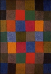
The header for this week’s blog is my own painting, Red amaryllis on acid green ground, which I painted after seeing the exhibit. You can see more of my work at www.floradiem.com.

Black, white, and red.

In the beginning, in the ancient world, there were three words for the basic three colors: black, white, and red. Black and white did not mean only black and white; black and white stood for light and dark. And without their own names, colors were subsumed under the rubric of black and white. It is hard to imagine for us, perhaps, how to get by without any color names but these three. In fact, Gladstone, the 19th century British minister who was also a Greek scholar, was convinced that the Greeks did not see any colors but the ones that they could name (sic!). But blue was often conflated with dark (hence, the “wine-dark sea” of Homer) ; and yellow and gold found their places under white.

For many folks, black is black and white is white, and there is an end to it. But for those of us who make our living or live our lives with color, nothing is so black or white. Black and white are like the idea of absolute zero; it is an idea, but in the real world it doesn’t really exist (or we can’t actually get to it!). There is no absolute black or white. We are aware of what black color or what white color it is; in essence, what cast the black or white has.

Some of this high sensitivity to color, I believe,  is the result of a couple of generations of Western capitalism. We are used to having a wide variety of colors to choose from in all our products from make-up to house paints to art supplies and so on. White and black are seen today as colors. White, especially, because it is an important color in house paints, papers, and clothing, comes in all sorts of casts. The white that is used most often up here in the North is a white with a yellow cast: a warm white. Decorator’s white is a much bluer color.

Black has also as many casts as there are hues. Ad Reinhardt, the twentieth century abstract artist, painted a series of black canvases that appeared totally black on first glance. However, when viewed over time, the canvases resolved themselves into black squares of various casts: blue-blacks, red-blacks, green-blacks, etc. The effect was rather like listening to a beautiful melody sung in a very very deep basso profundo.

We live in a very colorized society. The idea that color can be separated from the colored object doesn’t seem strange to us; we are all familiar with color chips representing our choices in everything from iPads to appliances. But there are still places in the world where a thing’s color can not be imagined except embedded in that thing. It is a way of looking at color that is very anchored in the physical world.

However, it was not just commodification that dislodged color from object. Abstraction and modernism made the connection between color and form much more arbitrary. I wonder if Kandinsky, who was one of the fathers of abstract painting, did not become uncomfortable at that final dissolution of color and its tie to the real world, and that is why he tried so hard at the end to create rules about which colors should go into which forms? But more on that in next week’s blog!

Color action: make two more collections of the widest range you can find of white and black. (My guess is that there will be more white color samples than black available!)

All my best wishes for a happy, healthy, and colorful New Year!

Red light or red stuff?

Red exists in the material world, the world that we can apprehend through touch. It is in earth (ground up paint pigments), in water (blood), in fabrics (silks, cottons, velvets, etc.), in fats (lipsticks and oil pastels). Red sits on the surface of objects or seeps into materials, but in any case is part of the tactile reality of things; and at this time of year especially!

There is, however, one part of the visible world that is untouchable and that is light. The stoplights at the corner of the street; the neon lights in the city;  the brilliant and evanescent lights of fireworks all carry color in the medium of light. And, of course, every image you see on your computer, phone, or pad, every movie, every television program, even the images you are looking at as you read this are light-generated!

Now it is true that all the color we see in the world of stuff is created by the bouncing of light waves off the object lit. For a red object, all the wavelengths of light are absorbed; only the red wave lengths are reflected resulting in the sensation that the object is red. But the color carried by light is a different thing.

1-1266497386cW30      subtractive diagramIf you have ever mixed paints, you know that as two colors are mixed, the resultant color is always darker than one of the parent colors. Theoretically, if you mix all the colors together you would get a black (in real life it is usually a very dark muddy charcoal). This is a subtractive system. But when colored lights are combined, the result is a lighter color. And if all the colors are combined, a white light is generated. This is an additive system.

So the question that I have been asking myself for the past couple of years is : what does it do to our sense of color if most of our experience of color are light-based? Do we get used to very brilliant, clear, unadulterated colors and are we then disappointed by colors created by paint, for instance?

This creates some dilemmas for both artists and paint venders. Paint companies provide online gorgeous collections of colors from which their customers can chose paint. But there is no way that the color seen on the computer screen and the color put on the wall can ever look the same. It is a problem of materiality, scale, ambient light, and the particular way the captured eye sees color versus the free eye.

By the captured eye, I mean the way the eye is held by visual process we have grown very accustomed to through photography and digital media. Digital images are flat; they have no substance, no depth. They can have the illusion of 3-D but they aren’t. They also do not change over time. What you see is what you get. And that experience (like the song of the artificial nightingale in the fairy tale ‘The Emperor’s Nightingale’) is always the same: beautiful but very limited.

paint closeupThe free eye, on the other hand, sees color in the material world as a nuanced experience. Even a monochromatic painting is not a flat color; as the eye moves alone the surface, microshadows can be noticed: the weave of the canvas, the dust adhering to the paint, the texture of the pigment, the movement of the brushstroke. And the color of the painting may change over time; the observer may see something different each time she looks at the color. And if the captured eye is habituated to see images in split seconds, how can we expect viewers to take the time to see our paintings slowly and carefully which is what we need them to do?

Please do not think that this is a criticism of digital media. I love the colors used onscreen (and here is a recent stunning example, very much in a Charley Harper style); but as a painter, I see the challenge this presents for painters. What is our choice? Do we follow Takashi Murakami and his Superflat, pitching the colors super high and flat and clear? Do we use highly saturated colors, even neon colors to compete with online color?

The usual movement too is from tactile objects through photography into digital images. And the cleaner and more defined the color of a painting, the better it looks online. Doesn’t this also put pressure on artists to create for the online distribution of their work- to use colors that photograph better?

Ibghy & LemmensAs an interesting aside, I went to the Montreal Biennale at the Musée d’Art Contemporain yesterday and saw a very witty piece that stood this movement from actual to digital on its head. It was a piece by Ibghy et Lemmens. They took graphs and charts that we are used to viewing as two dimensional, and they built very small whimsical constructs made out of everyday materials like toothpicks and wire to illustrate the same information. In other words, they reversed the process and made actual what was only virtual. In a very powerful but understated and artistic way,  it called into question the confidence we have in these statistics. The show is on until January 4th. (The photo above is mine.)

Color action: since this is a big holiday week, just take a look when you are online at the digital reds and compare them to Santa’s suit or your Xmas amaryllis.

Notice to my readers: this is a brand-new blog, and I’m still learning the best way to negotiate this virtual reality. It turns out that copyright is a complicated and difficult issue when using images. So, there will be more links and less photos taken from the net in my coming posts. The pics will either be in the public domain or will be my own work. If you would like to contribute, I would be happy to post your work or photos with a copyright notice!

The header this week is a detail of one of my red amaryllis acrylic paintings. You can see the full painting at my website: http://www.floradiem.com. And wishing you and yours a joyous holiday!!

Next week: what is black & white & red all over?

What red catches our eye?

Unknown-2                 New Harmony, 1936 red                  d102

cadmium red                          red                                alizarin crimson

Here are three of the reds that we have been looking at. Though colors appear slightly different on different screens, you should be able to see the cast shift between these three reds. The cadmium red is yellower (and therefor lighter) than the medium red; and the alizarin crimson is bluer (and therefor darker) than the other reds.

So how do artists, or any of us, chose one red over another? Well, I believe that we are all acutely, even if subliminally, aware of the colors around us. And the colors we are habituated to are tied very closely to the historical period in which we dwell; the material culture of that period’s society; and our personal color experiences.

New Harmony, 1936-1 New Harmony, 1936-1 copy

To take a small example, let’s look again at that warm earthy red that Paul Klee was so fond of using in the 1920’s and 30’s. The painting above is “New Harmony” one of his abstract square paintings from 1936. I am suggesting that that particular red was ubiquitous in the material culture at that time

Lucky Strike packageTarzanLargeFeature5

137559076600001                             color print 1930 Russian

. All sorts of ephemera-cigarette packaging (Lucky Strikes), book covers (Tarzan), comics (Capt. Billy’s Whiz Bang), textiles (this a design by a Russian designer, S. Burylin in 1930)-used that particular red. It was a very Art Deco red and it made its way into Klee’s mind without him being necessarily conscious of it. (This idea is very speculative, and I would love to hear from anyone doing material culture if this has been studied!) I wonder how many other artists have incorporated the colors of their time into their color palette?
88px-Pigment_store_in_Marrakech,_MoroccoTo return to the idea of color reflecting different time periods, textiles turn out to be a very good way to track changes in color over time. These changes resulted, in past centuries, from innovations and inventions in the dyes available. Eileen Trestain writes in her interesting color guide to fabrics between 1800-1960, that the earliest red was a medium red called turkey red (see the sample in the header) that was made from the madder plant and had been in use for millennium. It continued to be used until the turn of the 19th century when it was usurped by a chemical dye alizarin that produced a crimson red.

textile refs 3_Page_3       textile refs 3_Page_1       red fabric 1940

You can see the range of colors widening and brightening as the century progressed. And as the 20th century really got going, the changes came faster. Trestain writes that from 1900 through the 1920’s the red in circulation had a slight blue cast. Just a couple of years later, the red gave way to a more brilliant red with an orange cast. Today we can see new colors become contagions in a matter of months.

Those of us who make fashion our business (for tv and movie sets as well as clothing) know how to chose colors that evoke a time period as narrow as a couple of years (think of the changes in color in Mad Men as the 1950’s segued into the ’60’s and then 70’s!) and many of those colors are in the fabrics of the time.

hbz-duke-duchess-windsor-1941-de-94381401When I was a very small child in the 1950’s, I have a strong memory of my mother wearing deep clear red nail polish and the same red on her lips. She was following the fashion lead of Coco Chanel and the Duchess of Windsor (see the photo to the left of the Duke and the Duchess of Windsor, circa 1940).

Color Action: so to become more attuned to our present day colors- and maybe to discover why we like what we like in colors- let’s return to the color reference library we are building up. (A small suggestion for organizing these references: cut white bristol board to 8 inches x 10 inches. Attach the samples to these boards and slip the boards into 9 inches x 11 inches clear plastic loose leaf files that can be put into a loose leaf binder.)

The printed colors in paint stores as well as the matte colors in the Pantone books show red in only one type of material. But if you look for samples of reds in the ephemera of today, you will notice how different the same red looks in grosgrain ribbon or satin fabric or newspaper circulars, or glossy fashion magazines or nail polish. Some reds seep into the fabric and attain a depth and brilliance that cannot be matched in color chips and some are in velvets that change depending on what direction one looks at them.

You may have noticed that I have not mentioned the most usual place to find color,and that is online and on screen where images in brilliant color inundate us daily. But more on that in next week’s post!


Red is December’s color!

As I was writing the blogs for the next couple of weeks-and I will be posting once a week-I realized that there was a great deal to share under the rubric ‘red’ (and incidentally, ‘rubric’ is from the Latin rubeus meaning red because the headings were written in red ink!) So I will stick with red for a while: as Jarman wrote, this color will keep us warm during a cold dark month.

What do we see when we see red? Wikipedia defines red as the color at the end of the visible spectrum next to orange and at the opposite end from violet. The wavelength of red light is approximately 620–740 nm on the electromagnetic spectrum. That is the scientific idea of red. How very clear and concise. But if Josef Albers is right and the word ‘red’ conjures up fifty different reds for fifty individuals, where do all those different reds come from?

First of all, red is part of a continuum that lies between orange and violet. As the red shifts toward one of its neighbor or the other (these neighbours are known as analogous colors), the nature of the red changes. We say the red has a different cast. That cast is more to the yellow side as it moves toward orange, and more to the blue side as it moves toward violet.

cropped-analogous-colors.png You may have noticed that I don’t use the commonly accepted terms of warm and cool to describe color. It has no basis in science as blue is the hottest part of a flame, and red indicates a cooling star. I think it is more useful to think of a color’s cast in its relationship to either blue or yellow. Cadmium red has a yellow cast. Alizarin Crimson has a blue cast. But since this is a continuum, at what point does the color change from a vermillion to an orange, or from a magenta to a violet?           copy-reds-with-blue-cast.jpg

What red do you see when the word red is said? What red would you choose as your favourite red? If you have ever stood in front of a display of paint chips in a paint store you know the overwhelming feeling of too many choices. But each of us actually has an internal palette of our favourite colors. And these personal choices come from our experiences, memories, and the effect on us of our time and culture.

For those of us who are painters, the reds we tend to think of are in the nature of the paints we use: cadmium red, alizarin crimson, vermillion, etc. Many of us are passionate about certain hues.. UnknownPaul Klee used an earthy orangish deep red in often for his magic square paintings, such as ‘Fire in the Lake’ (1928) which is to the left. I am sure that every time he put it on the canvas, he got a thrill. Certain colors simply make us artists happy!


Right now in Montreal, you can see a spectacular painting by Franz Marc of a nude on a brilliant vermillion background in the Musée des Beaux-Art‘s show De Van Gogh à Kandinsky. 6869250a5d51a563df56df4d29a12baa(The reproduction on the right does not do it justice!) You know that vermillion had him jazzed! Especially as, at the turn of the twentieth century, it was the first time in a long time, that artists returned to fully saturated bright colors!

Then there were the painters who really dug red! Before he painted all black works, Ad Reinhardt created a red series (Number 5, Red Wall, 1952).


And certainly Matisse’s Red Studio (1911 is one of the great red paintings of all time. I wonder if Matisse got the idea for a red studio painting as he came in one day from his green garden and noticed a reddish afterimage when he looked at the white walls?

I do have one important caveat when looking at art online: be aware that it is impossible to tell the actual sizes of the works (and size definitely matters in how a painting is experienced!). The Paul Klee is a small piece (37 x 36 cm), the Ad Reinhardt much larger (203.2 x 106.7 cm), and the Franz Marc somewhere in-between.

To return to my original question: how can you discover what colors you like? I will be offering advice at the end of each post, on how to develop your personal color vocabulary, whether you are an artist or color aficionado:

Color Action: The best way, I have found, is to collect color references. And one of the best places to find colors (for free!) is at your local paint store. Keep the chips in a plastic box or bag: this will be the start of your own color reference library!

Next post: has the idea of what red looks like changed through history?

Life is red!

Welcome to the launch of my blog, realm of color. The realm of color is a commonplaces site wherein are collected notes and pictures on the use of color by artists, past and present; the pedagogy of coloring (as a painter teaches painting or a draughtsman teaches drawing, so I teach coloring); the writing on color by artists, philosophers, poets, etc.; and the thinking about color as it operates in perception, nature, society, and culture. You will find here too a bibliography of books, films, and articles on color, art, visuality, culture, etc., and links to artists and thinkers for whom color is central to their work, as well as a glossary with definitions of color terms and information.

I am taking the color red, as the starting point for this first post, in honor of this year’s World AIDS Day (December 1, 2014): getting to zero. Zero new HIV infections. Zero discrimination. Zero AIDS-related deaths. The red ribbon which represents one’s commitment to working to raise awareness about AIDS was the brain-child of a group of artists in my hometown of New York City. The Visual AIDS Artists Caucus created a visual symbol to demonstrate compassion for people living with AIDS and their caregivers. The color red was chosen for its, “connection to blood and the idea of passion — not only anger, but love, like a valentine.” The “ethical consumerism” project (RED) also uses the color as a logo/brand.

This first excerpt is from Chroma, the last book (also a commonplace book) by the amazing artist and filmmaker, Derek Jarman, who wrote this as he was dying of AIDS in 1994. (Is it a curious coincidence-or not!-that color was also the subject of Goethe’s last book, Theory of Colour, and Wittgenstein’s final book, Remarks on Colour?)

In his chapter ‘On Seeing Red,’ Jarman writes:

“Red is a moment in time. Blue constant. Red is quickly spent. An explosion of intensity. It burns itself. Disappears like fiery sparks into the gathering shadow. To warm ourselves in the long dark winter when the red has departed. We welcome the robin redbreast, and the red berries that sustain life. Dress in the Coca Cola red of Father Christmas, the bringer of gifts. We sit around the table and sing ‘Rudolph the Red Nosed Reindeer’ and ‘The Holly and the Ivy’. ‘The holly bears a berry as bright as any blood.’ Our winter faces are dyed a cheerful red. We preserve the red like a flame. Life is red.”

So we see what red can mean. We know what red is. Or do we? Josef Albers noted in his textbook, Interaction of Colour:

“If one says red (the name of the colour) and there are fifty people listening it can be expected there will be fifty reds in their minds, and one can be sure that all these reds will be different.”

But more on this in my next post as we look beyond color as a symbol or an idea to how we actually see color.

Meanwhile, please send me interesting links and information about color that you come across!

And wear the red ribbon so we can get to zero!